Skill Summary
| Language | Method |
| Adobe InDesign | Infographic |
| Excel | Bar chart |
Analysis & Design Portfolio

| Language | Method |
| Adobe InDesign | Infographic |
| Excel | Bar chart |
I went through a thought exercise to see what I could do with a cross tabulation, like the one below. It shows NYC Open Data Overall School Grade data from the 2009 to 2010 school years.

I started by changing the table style in order to guide the reader towards decoding a particular message in the data: number of schools with upgrades vs downgrades.

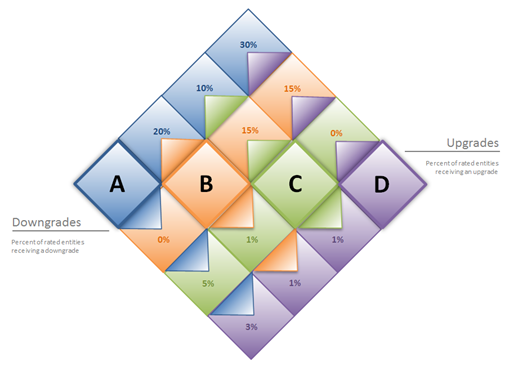
I pulled together an infographic to see if there was a more interesting way to present the data

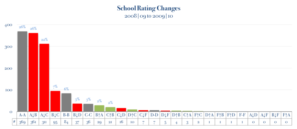
I also drew up a chart for a visual way to compare volumes.
